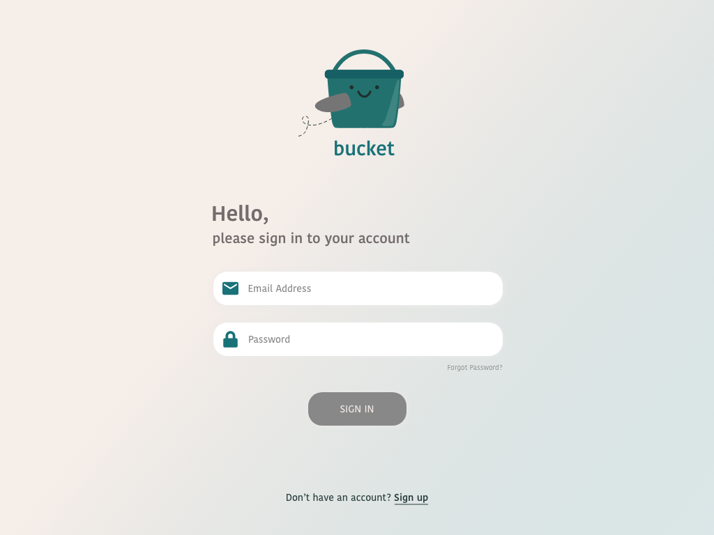
Bucket
Bucket is an interactive iPad app designed to reimagine the traditional in-flight magazine as a digital travel companion. Inspired by the idea of a “travel bucket list,” it allows users to plan itineraries, explore destinations, and organize trips — both during flights and anytime they’re dreaming of their next adventure.
Created as part of a personal design challenge, this project allowed me to push my creative limits and explore how thoughtful UX and visual storytelling could turn travel inspiration into an interactive, personalized experience.
Project Details
Year: 2022
Skills: UX, UI
The goal was to design an app that transforms in-flight entertainment into something interactive and useful — helping travelers plan, discover, and connect with their destinations.
The focus was on building a tool that’s playful, intuitive, and efficient, and equally enjoyable to use during a flight or while planning at home.
The brief
Designing Bucket allowed me to explore the intersection between functionality and curiosity, creating something that’s equal parts practical tool and digital daydream.
Through this project, I refined my skills in UX design for tablet interfaces, information architecture, and visual storytelling, while learning how to design with both exploration and simplicity in mind.
Ultimately, Bucket reminded me why I love design: the ability to turn small sparks of inspiration into experiences that make everyday moments, even an airplane ride, a little more magical.
The impact
Understanding the problem
Most in-flight entertainment options are designed for passive consumption: reading, watching, or scrolling, but they don’t encourage interaction or meaningful engagement. Bucket set out to change that by transforming travel downtime into a moment of exploration and inspiration.
The goal was to design a user-friendly, visually engaging iPad experience that lets travelers plan, discover, and reflect on their journeys, all in one place. I wanted to create an app that felt both practical and playful, capable of sparking wanderlust while staying grounded in usability.
I approached this project with a focus on user-centered design and interaction flow, treating the app as both a travel planner and a creative companion. My process began with defining the core needs of modern travelers: simplicity, personalization, and connection.
After exploring various layout ideas and navigation patterns for tablets, I designed a structure that encourages curiosity while remaining easy to navigate. The interface prioritizes clean organization, intuitive gestures, and touch-based interactions that feel natural on iPad.
My approach
“The messy sketches”

Throughout the process, my goal was to make every screen feel like an invitation and an open map of possibilities that evolves with the user’s journey.


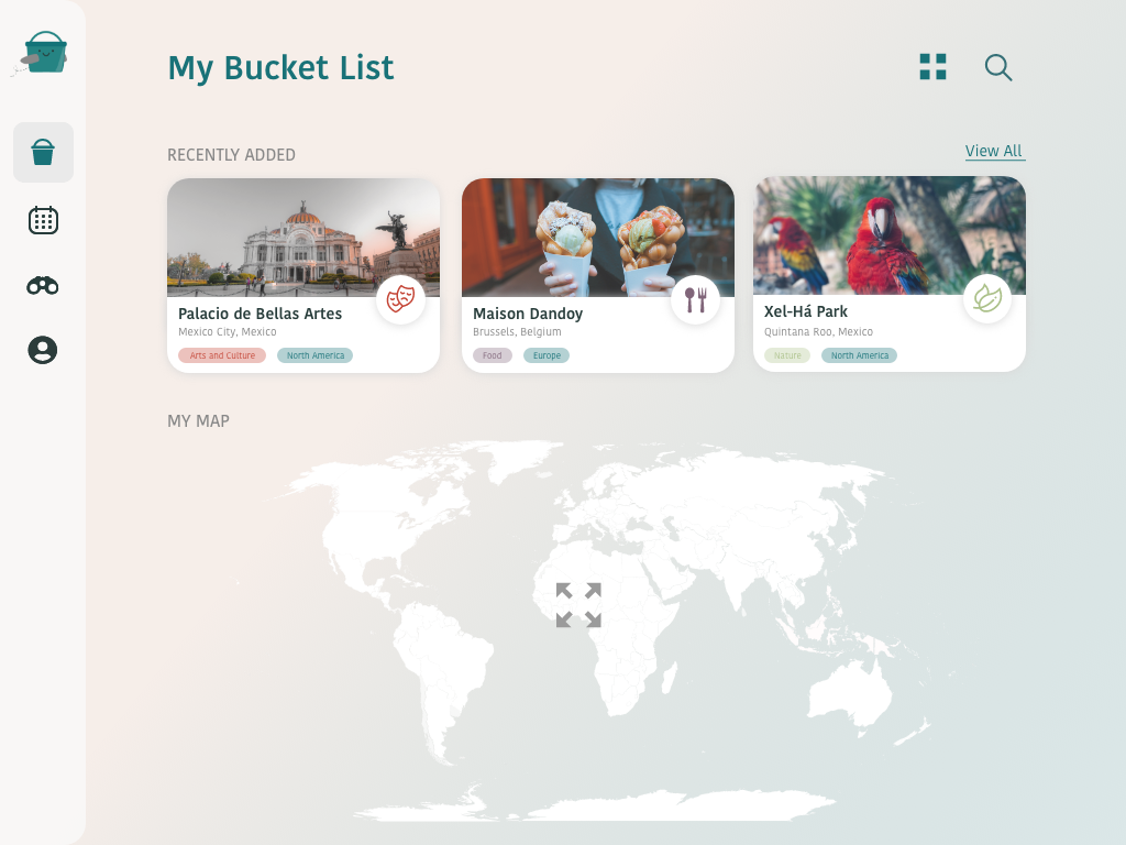

Key features
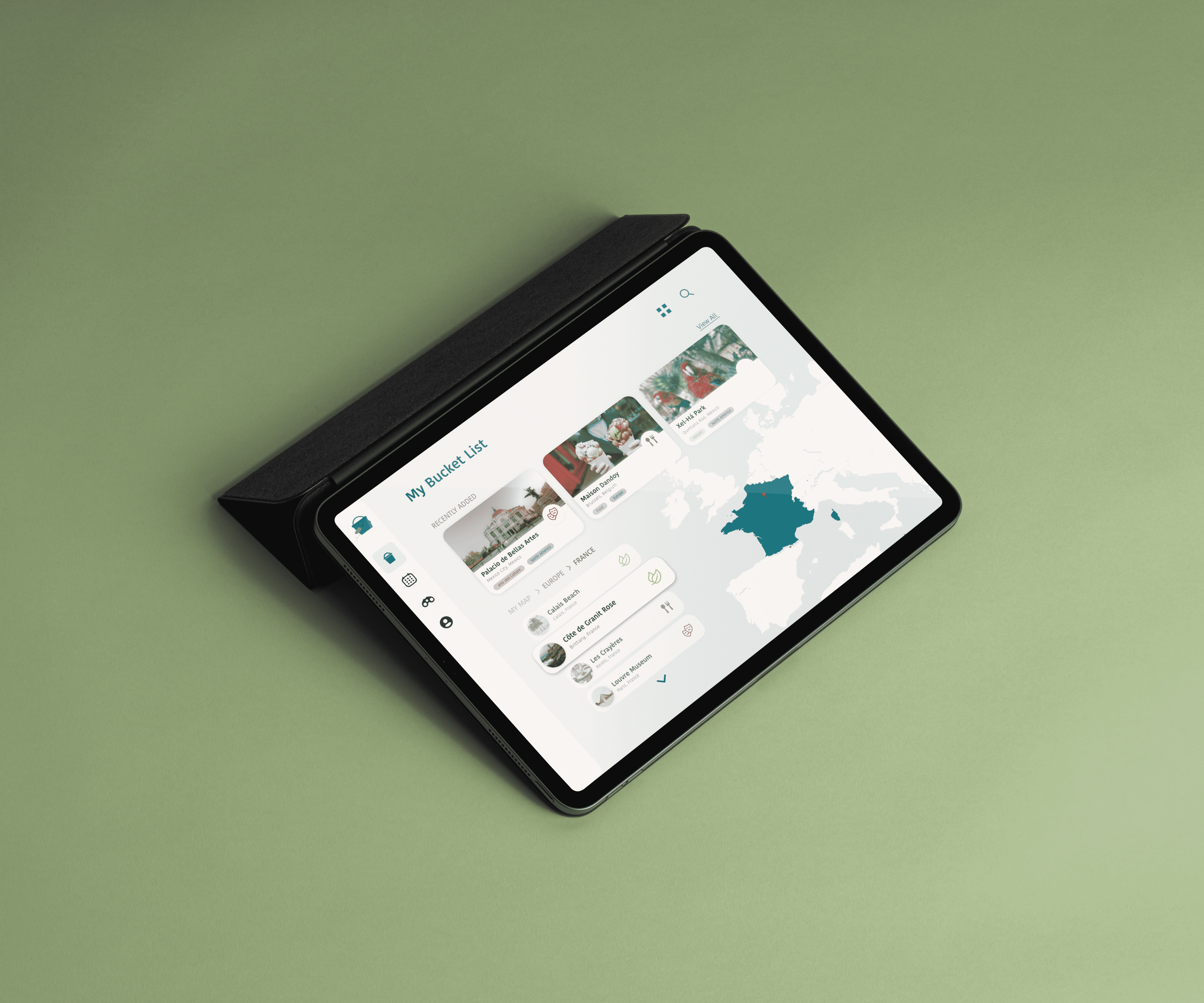
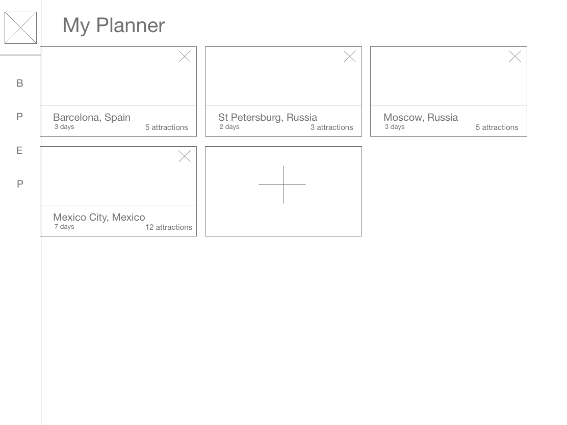
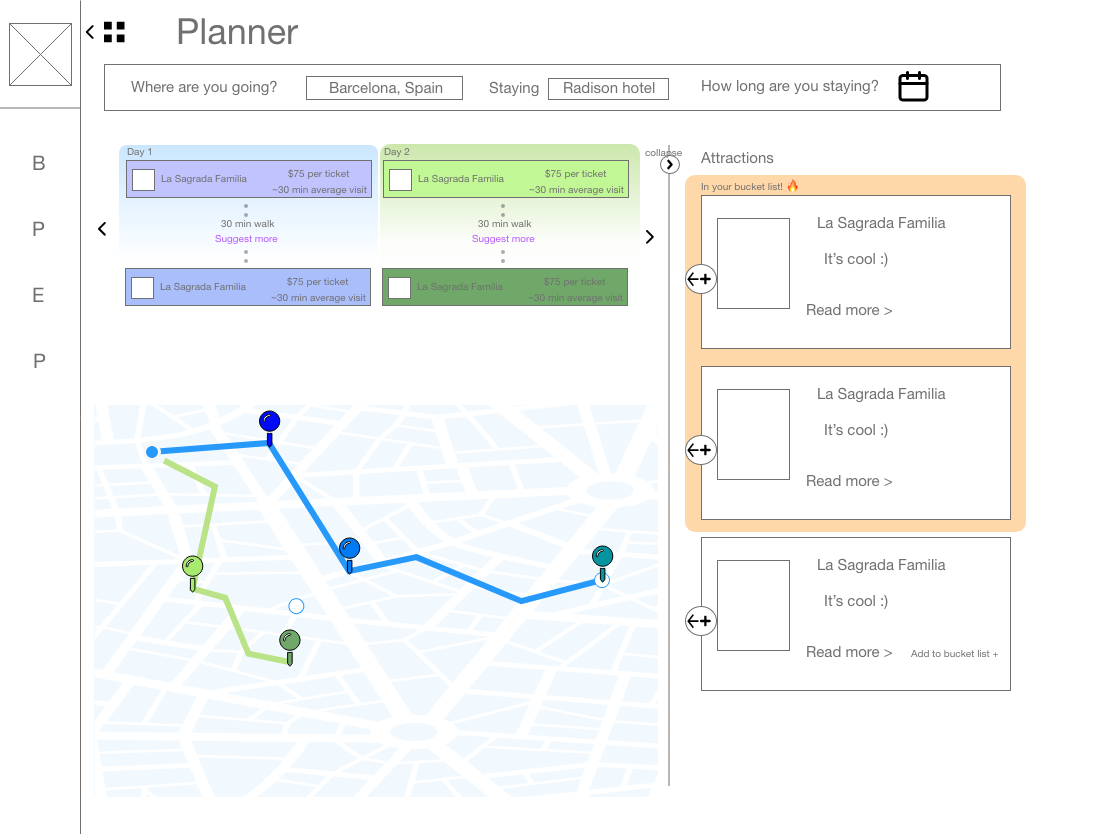
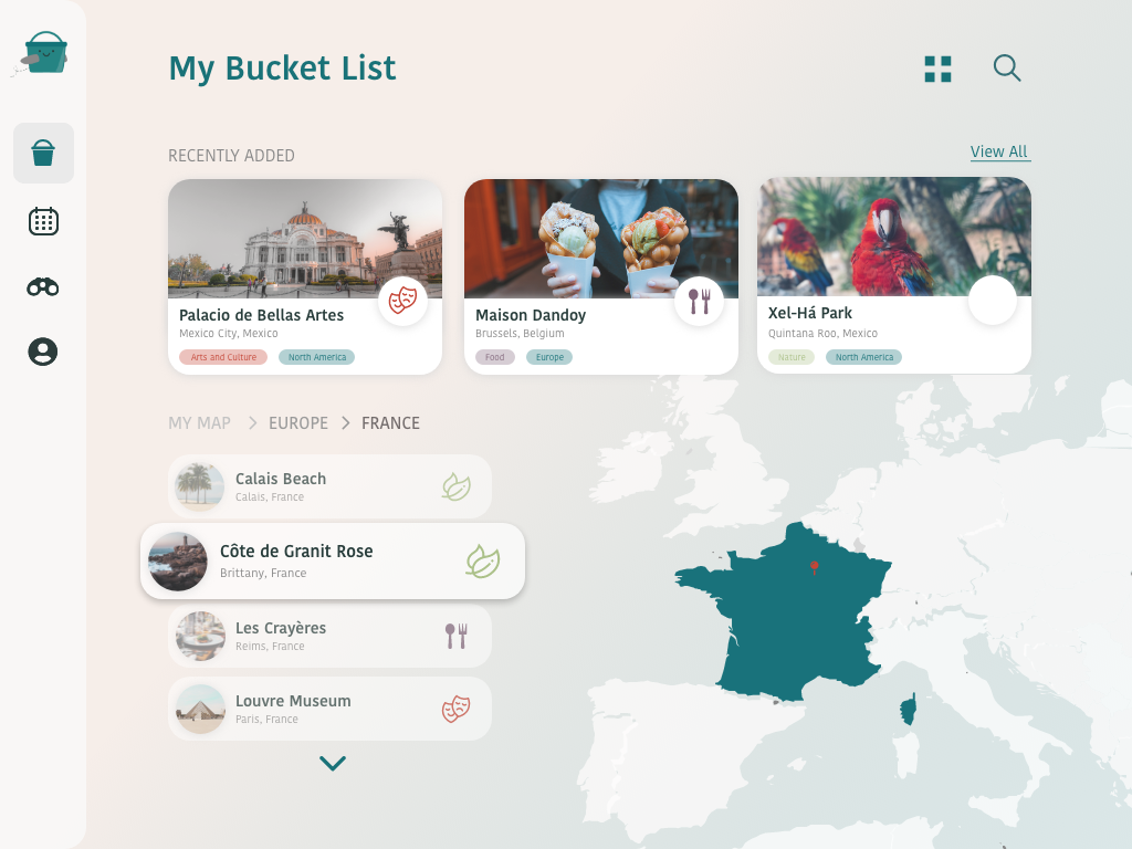
Bucket was designed as a tablet experience built around four main features that work together to inspire and organize travel:
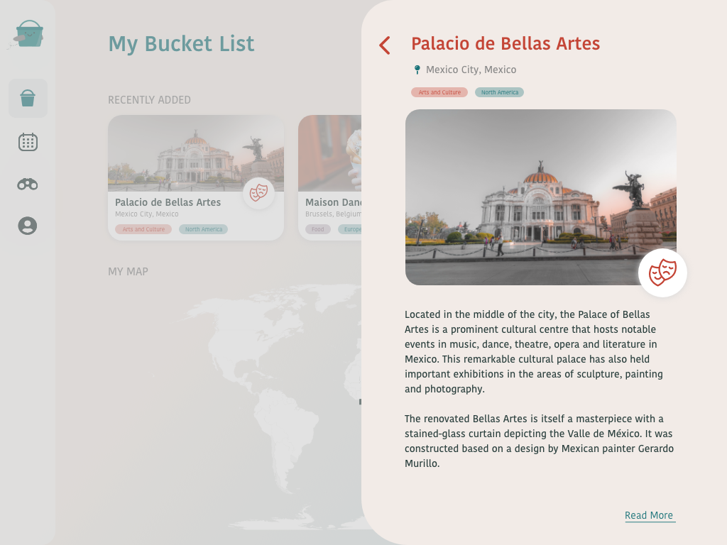
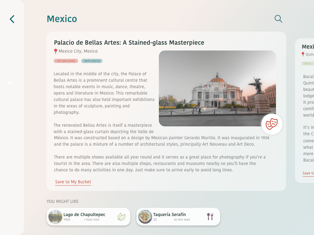
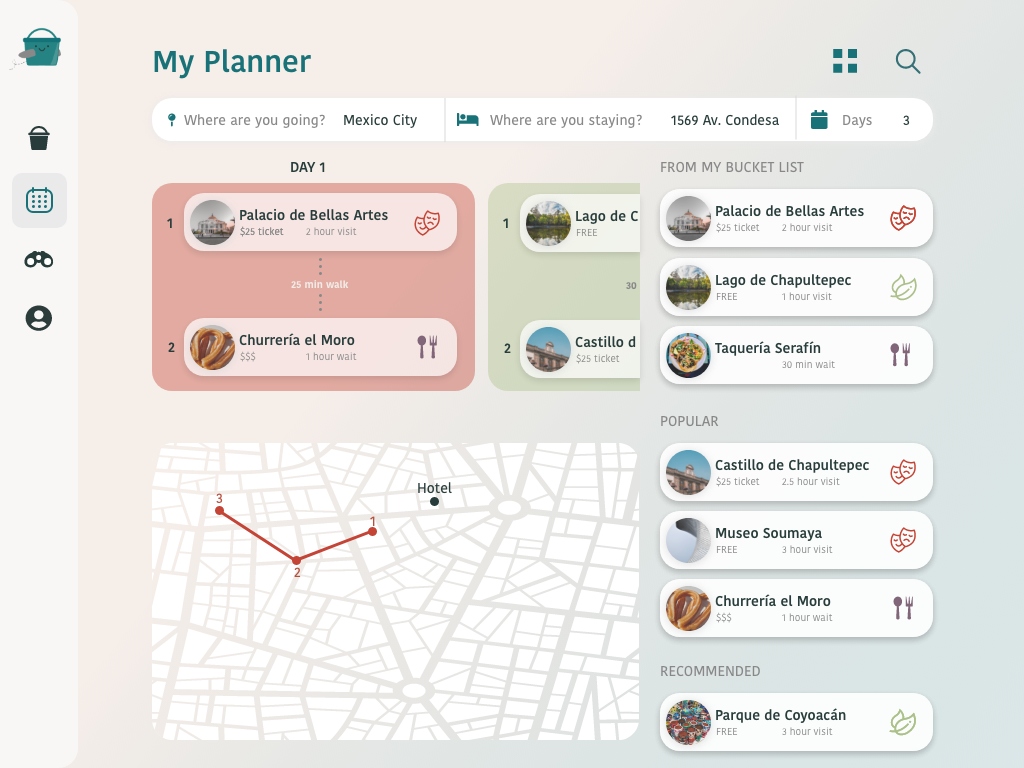
Itinerary Builder: create or auto-generate daily travel plans based on trip length and interests.
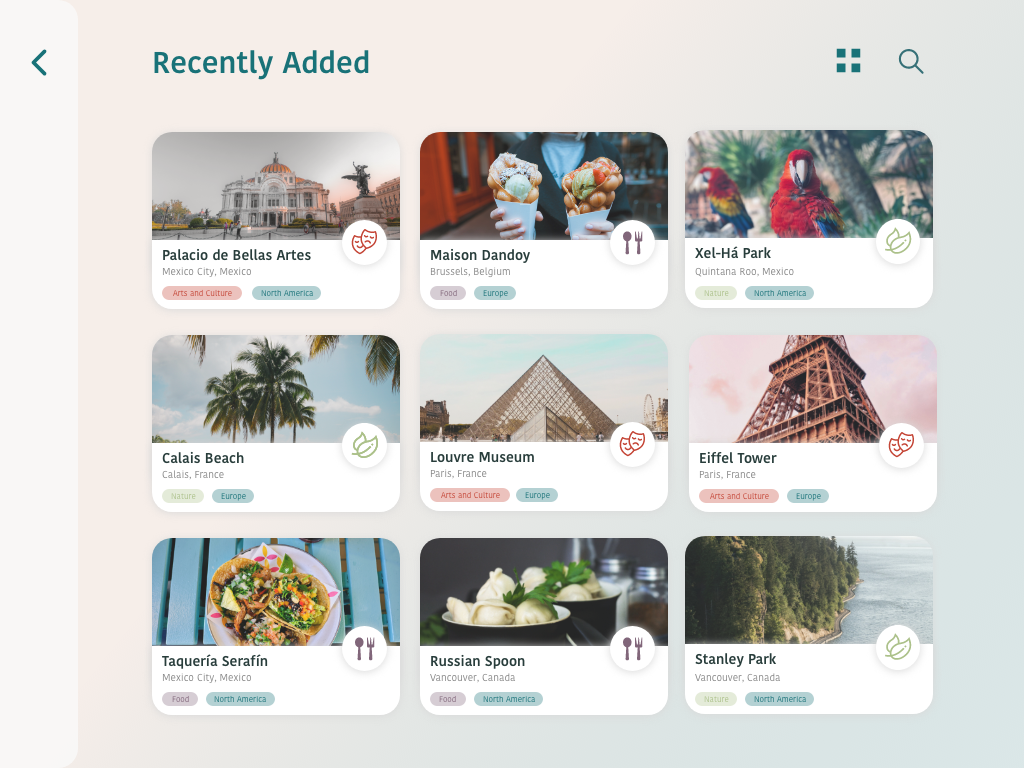
Points of Interest Filters: discover places by category such as food, entertainment, green spaces, or cultural spots.
Calendar Integration: plan future trips and visualize upcoming travels in one organized view.
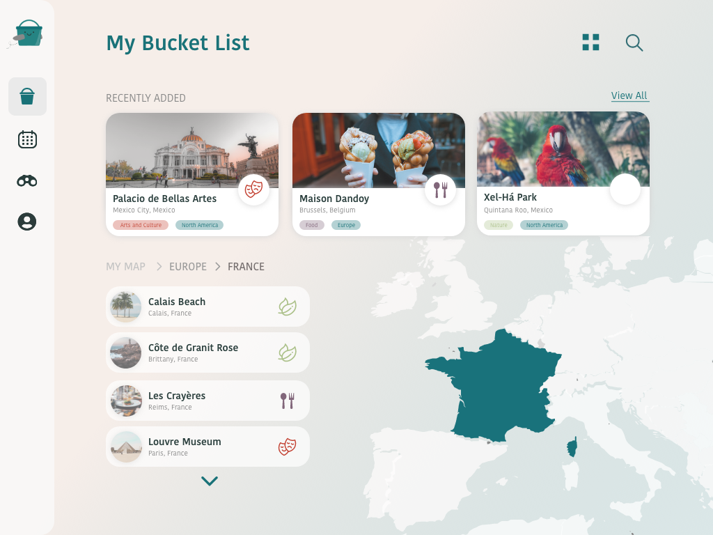
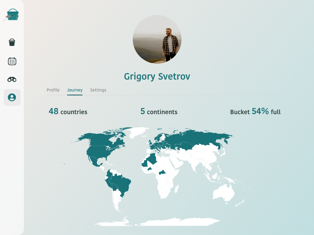
Interactive Map: view previously visited locations and explore the cities still on your bucket list.
Each feature was designed to feel interactive, fluid, and cohesive, turning the trip planning into a tactile, inspiring experience that travelers could enjoy both offline and online.
Findings and insights
Through testing and feedback, I learned how crucial clarity and flow are when designing for travel contexts. Users wanted to explore, but they also valued efficiency and quick navigation, especially when planning mid-flight or on limited time.
Early iterations had more complex animations and layered interactions, but I simplified them to create a smoother, more intuitive experience. Visual hierarchy, iconography, and touch gestures became key as they helped users glide between itinerary planning, map exploration, and discovery without friction.
I also noticed how personalization deeply motivated users. The ability to save favorite spots, track visited cities, and build dream itineraries made the app feel more personal and emotionally rewarding. This reinforced my belief that great travel design should balance function and feeling, and also help users dream while staying practical.
Takeaways
-
Working on Bucket challenged me to think about design from both a strategic and emotional perspective. It wasn’t just about crafting a functional interface, but about designing an experience that could spark curiosity and joy.
I honed my skills in:
Designing specifically for tablet interactions and large-screen gestures
Structuring clear information hierarchies for multi-section apps
Balancing motion design with accessibility and simplicity
Creating a unified visual language that feels playful yet professional
-
Above all, I learned that thoughtful design can transform even the simplest experience, like flipping through a travel magazine, into something immersive and meaningful. When design connects information with emotion, it turns functionality into inspiration.