Shine Bootcamp
Shine Bootcamp is an accelerator program created to help women build confidence and clarity in their public speaking journey. It provides a supportive space where participants can strengthen their communication skills, craft authentic stories, and step into the spotlight with purpose.
Project Details
Year: 2021
Services: UX, UI, motion, and graphic design
The brief
Shine Bootcamp was looking to strengthen its visual identity and create a more cohesive presence across digital platforms. The goal was to refine how the brand communicated its mission of empowering women to grow as confident, impactful speakers, through consistent storytelling and design.
The team needed a refreshed website experience that clearly conveyed Shine’s value, built trust with potential participants, and captured the supportive spirit of the program. Alongside that, the focus extended to improving brand presence on social media to boost visibility and drive sign-ups for upcoming bootcamps.
Outcomes & Impact
Our final design solution strengthened Shine Bootcamp’s online presence across multiple touchpoints. Through a dynamic motion piece, we boosted engagement and reach on social media, helping the brand connect with a wider audience.
On the main conference website, we improved accessibility and streamlined the user flow which created a smoother, more inclusive experience for both new and returning participants.
Our team, Formula 6, was selected by Shine Bootcamp as the winning project, and we were also honored with the VFS Award for Best Team Project.
This collaborative project involved redesigning a website, creating a motion piece, and increasing Shine Bootcamp's overall online presence to boost ticket sales for their upcoming conferences.
The team for this project was called Formula 6, consisting of six members split evenly into three interactive designers and three motion designers.
Since this project's scope turned out to be significant, we decided to split the teams into the specialization of their choice. I mainly focused on the UX/UI redesign of the website but also contributed to the motion piece.
The team & my role
Identifying initial challenges
During our evaluation, several key pain points surfaced:
The website wasn’t engaging enough for conference organizers.
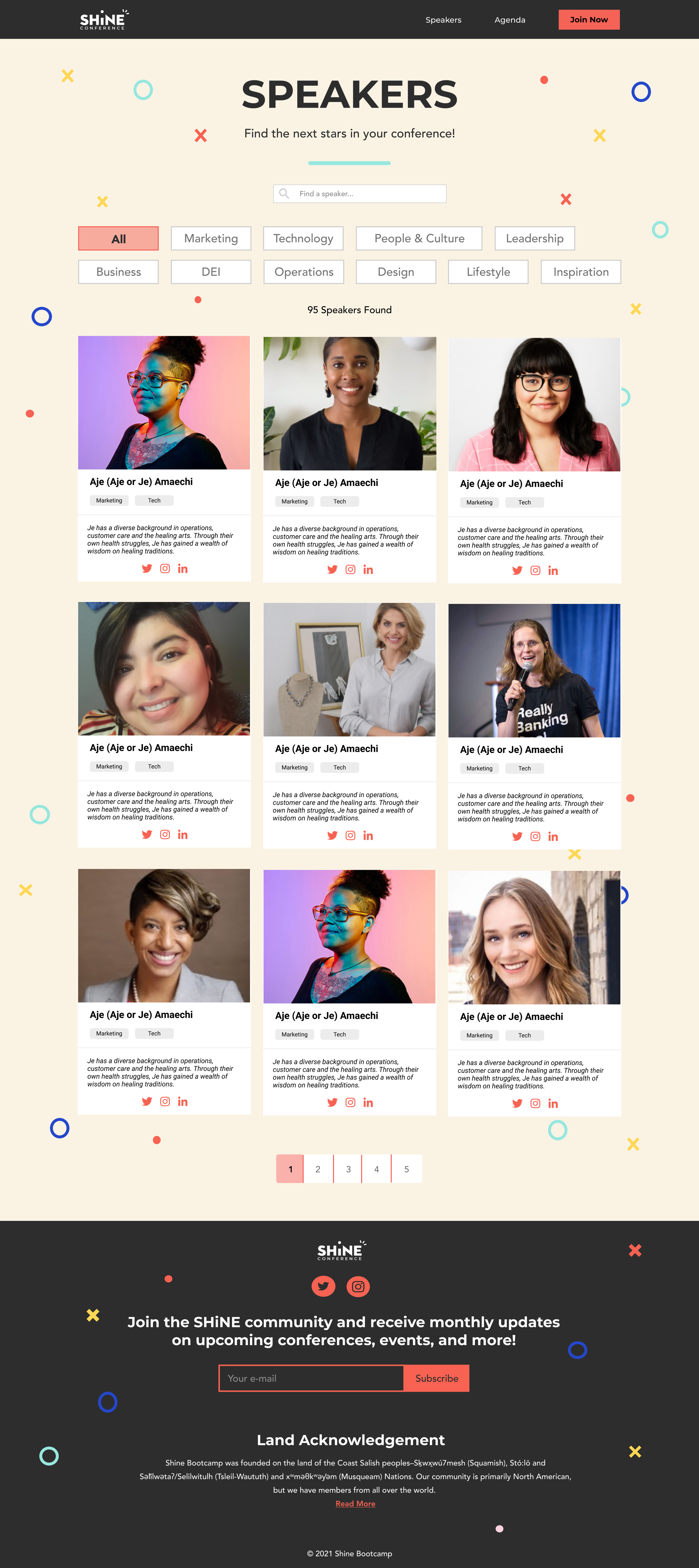
The speaker gallery made it difficult to find or learn about speakers.
The “subscribe” button lacked clarity about what users would receive.
There was no clear navigation path between the main site and the conference site.
The visual layout felt cluttered and confusing.
It was difficult for users to locate the conference site due to a confusing flow.
These findings provided the foundation for defining actionable design goals.
Understanding the problem and defining direction
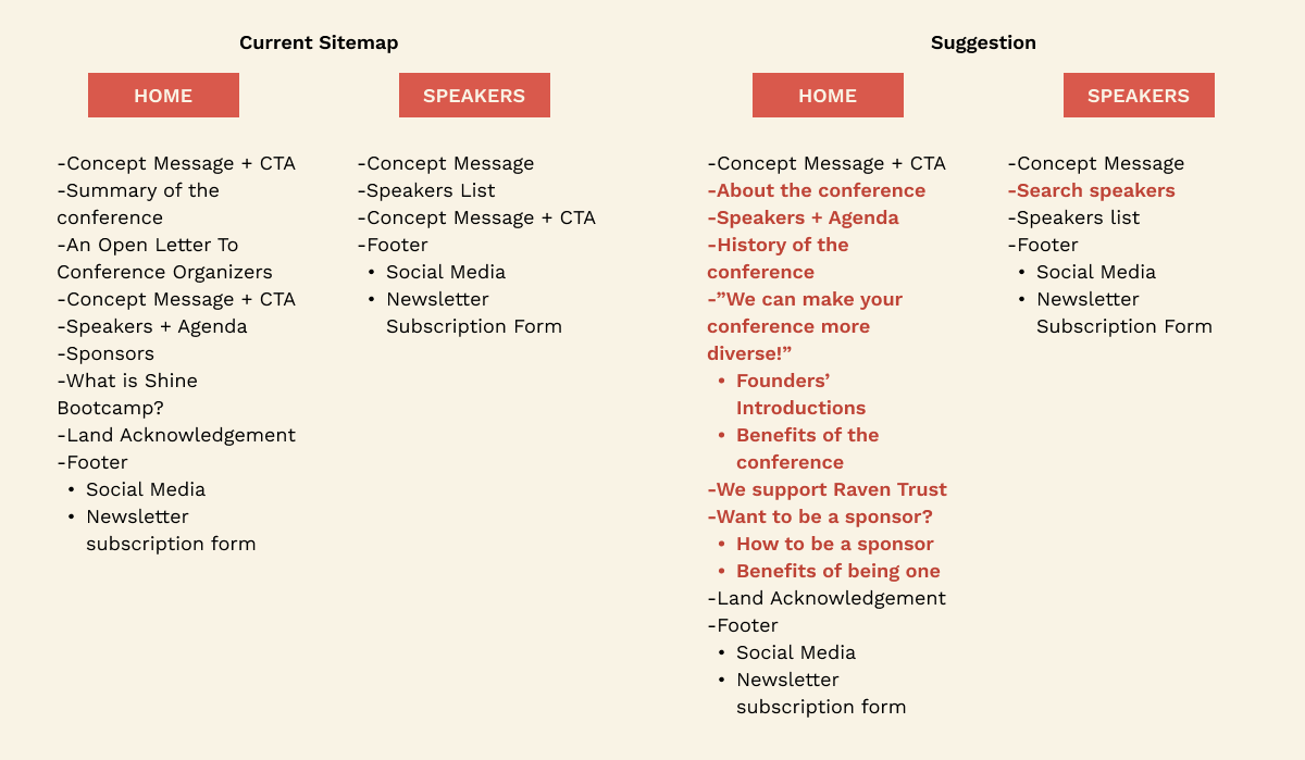
We began by analyzing Shine Bootcamp’s existing sitemap and overall site structure to understand its flow, functionality, and limitations. This helped us clearly outline the project scope and define the priorities in the redesign.
Through a heuristic evaluation, we identified that one of the main issues was the home page, which lacked clarity and visual hierarchy. We also focused on the speakers page, improving visibility and consistency while ensuring users received the right feedback at the right time.
Our overarching goal was to simplify the user experience across all website pages and strengthen the brand identity. The redesign also needed to stay visually aligned with the promotional motion piece, maintaining a unified tone across every digital touchpoint.
Defining the goals
Using these insights, we outlined clear objectives to guide our redesign:
Strengthen Shine Bootcamp’s online presence and increase ticket sales for upcoming conferences.
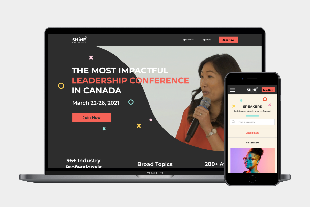
Redesign the conference website for desktop and mobile with a more intuitive structure and engaging visuals.
Improve navigation and accessibility between the main and conference sites.
Create a 30-second promotional motion piece aligned with the refreshed brand identity.
Research & Insights
We began with the heuristic evaluation of the existing Shine Bootcamp Conference website to identify key issues, areas of opportunity, and the target audience.
Our research showed that most traffic came from social media, especially Instagram, which guided us to focus on creating a smoother first-time experience for visitors arriving through this social media channel.
We defined three main user groups:
Conference Organizers, managing events and speaker details
Learners, attending conferences and seeking accessible content
Friends and Family, supporting participants and staying updated
These insights helped us shape our redesign strategy which focused on the navigation, content simplification and improving the overall experience for all web visitors.
User journey
8
iterations
4
user tests
tons
of meetings
many
cups of coffee

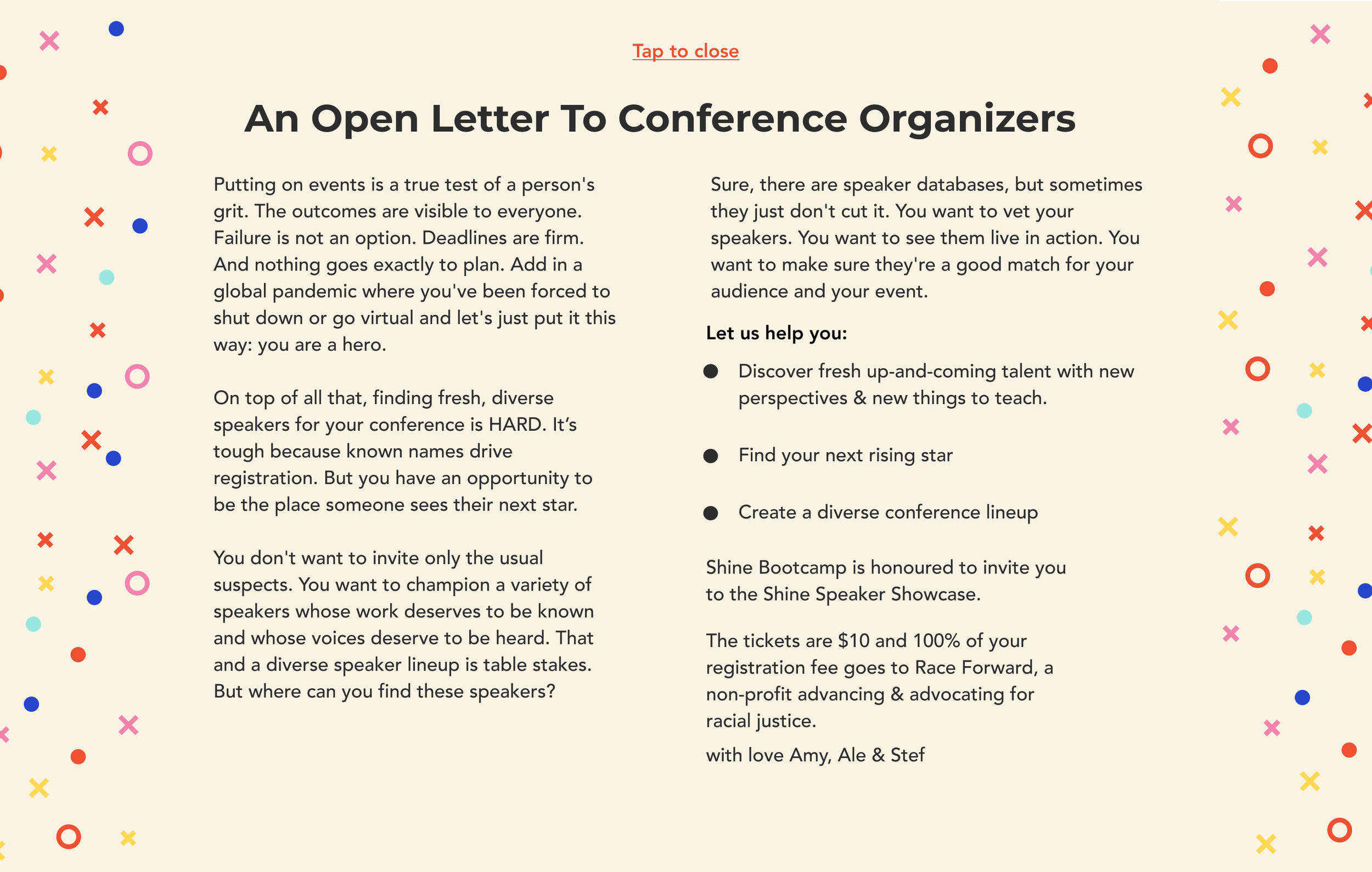
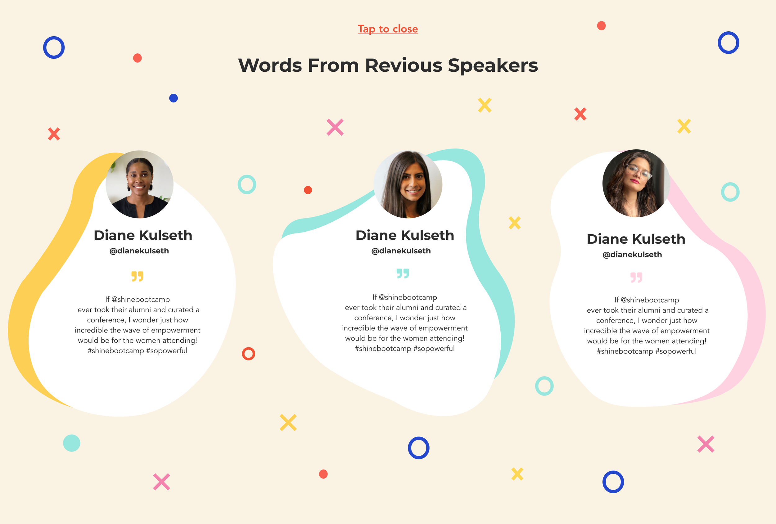
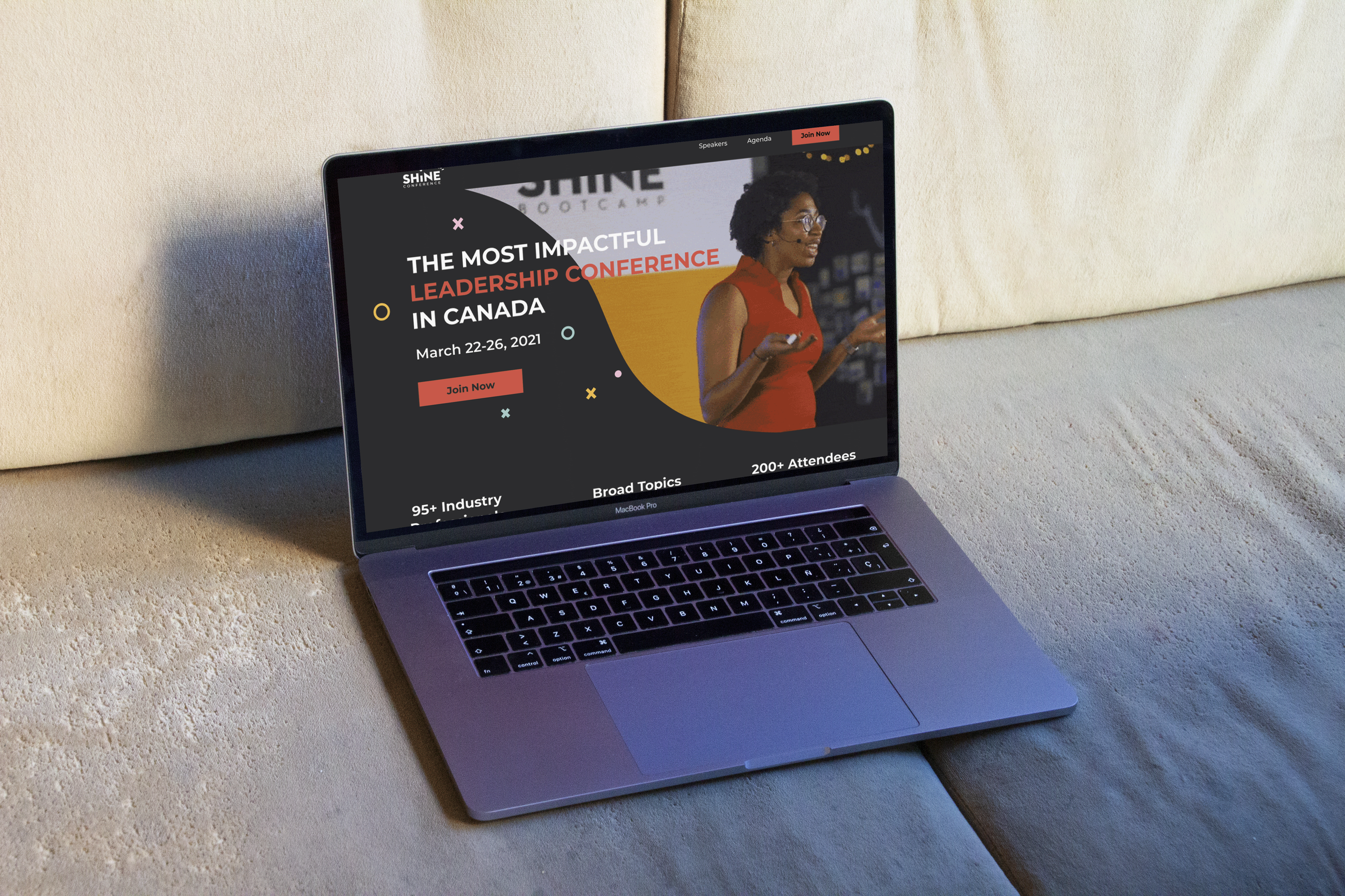
The homepage served as a crucial decision point because it’s where users decided whether to join the conference by purchasing tickets. To make that moment engaging, we focused on crafting an inviting hero section that immediately captured attention. By featuring video clips from past events, we created a dynamic, immersive atmosphere that sparked curiosity and encouraged users to scroll, explore, and learn more about Shine Bootcamp.
Encouraging exploration on the homepage
Because most visitors were arriving from social media, we assumed a baseline familiarity with Shine Bootcamp but knew it was still essential to provide clear, accessible event details.
To help users make faster, more informed decisions, we placed concise informational sections right below the hero banner by outlining the event’s speakers, topics, and audience in a way that felt approachable and easy to digest. This not only built trust but also supported smoother conversions for ticket sales.
Providing clarity about the event
In the end, our goal was simple: to make Shine Bootcamp’s digital experience as empowering and inspiring as its mission.
Takeaways
-
Working with such a talented group of people meant every idea got a fresh perspective. Our meetings turned into creative jam sessions where we could bounce ideas around, give honest feedback, and refine things together until they really clicked.
Collaboration pushes you to see things differently, and it almost always leads to stronger, more thoughtful design.
-
Good communication really is everything in the design process. While it can feel a bit intense to keep everyone constantly updated, staying in touch with the client and other stakeholders made a huge difference.
Regular check-ins and open feedback helped us catch issues early, stay aligned, and save time during the design process.

